
Let’s be real. There is nothing worse than of designing “high converting ad creatives.”
You know that feeling when you spend weeks on planning a campaign. You hired a videographer, found the perfect models, and worked on every pixel until it looked like a Super Bowl commercial. You hit publish, poured ₹50,000 into it, and waited for the sales to roll in.
And then… nothing. A few courtesy likes from your employees. Maybe one expensive lead.
Meanwhile, your competitor just shot a shaky video on their iPhone in a dim light room, put some ugly text over it, and they are absolutely crushing you.
What is going on? You are missing the key elements for high converting ad creatives
Welcome to advertising in 2026. The game has completely flipped.
If your ads aren’t working, it’s probably not your targeting. The algorithms are smart enough to find your customers now. The problem is almost certainly lack of high converting ad creatives.
In 2026, “looking professional” is often the fastest way to look like spam. People are tired of being sold to. They have developed “ad blindness” to anything that looks too polished.
So, what actually stops the scroll today?
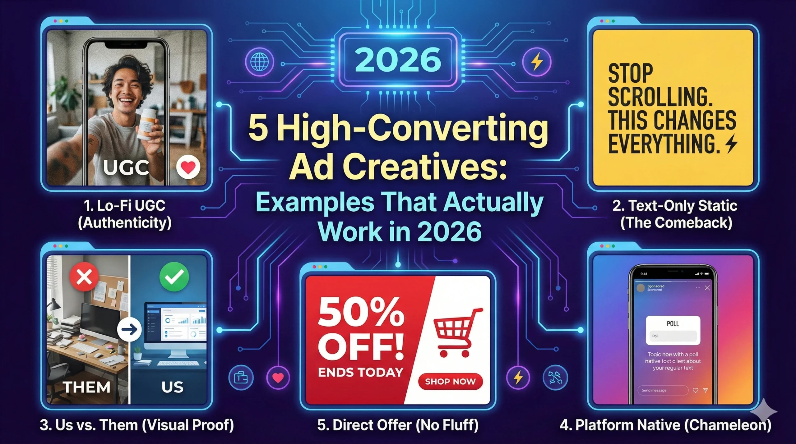
I’m going to show you. We have analyzed thousands of campaigns to identify the patterns that are working right now. Forget the trends of 2024. Here are the 5 examples of high-converting ad creatives that you need to steal for 2026.
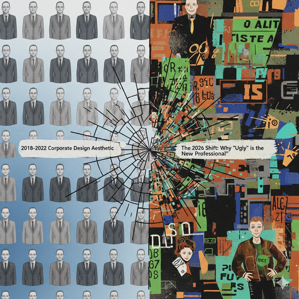
The 2026 Shift: Why “Ugly” is the New “Professional”
Before we look at the examples, you need to understand the philosophy shift.
For the last decade, the goal of ad creative was to look as high-budget as possible. The thinking was: High production value = Trust.
In 2026, that equation has broken. Now, it often looks like this: High production value = “They are trying too hard to sell me something.”
Today’s consumers, especially Gen Z and Gen Y, value authenticity over perfection. They trust a real person holding a product in their messy kitchen more than a model holding it in a studio.
High converting ad creatives in 2026 don’t look like ads. They look like content.
They blend into the Feed, the Reels, or the For You Page. They provide value or entertainment first, and sell second. If your creative screams, “Look at me, I’m an ad!”, people will scroll past it faster than you can say “CTR.”
Keep this “anti-ad” mindset as we look at the examples.
Example 1: The “Lo-Fi” UGC (Authenticity Wins)
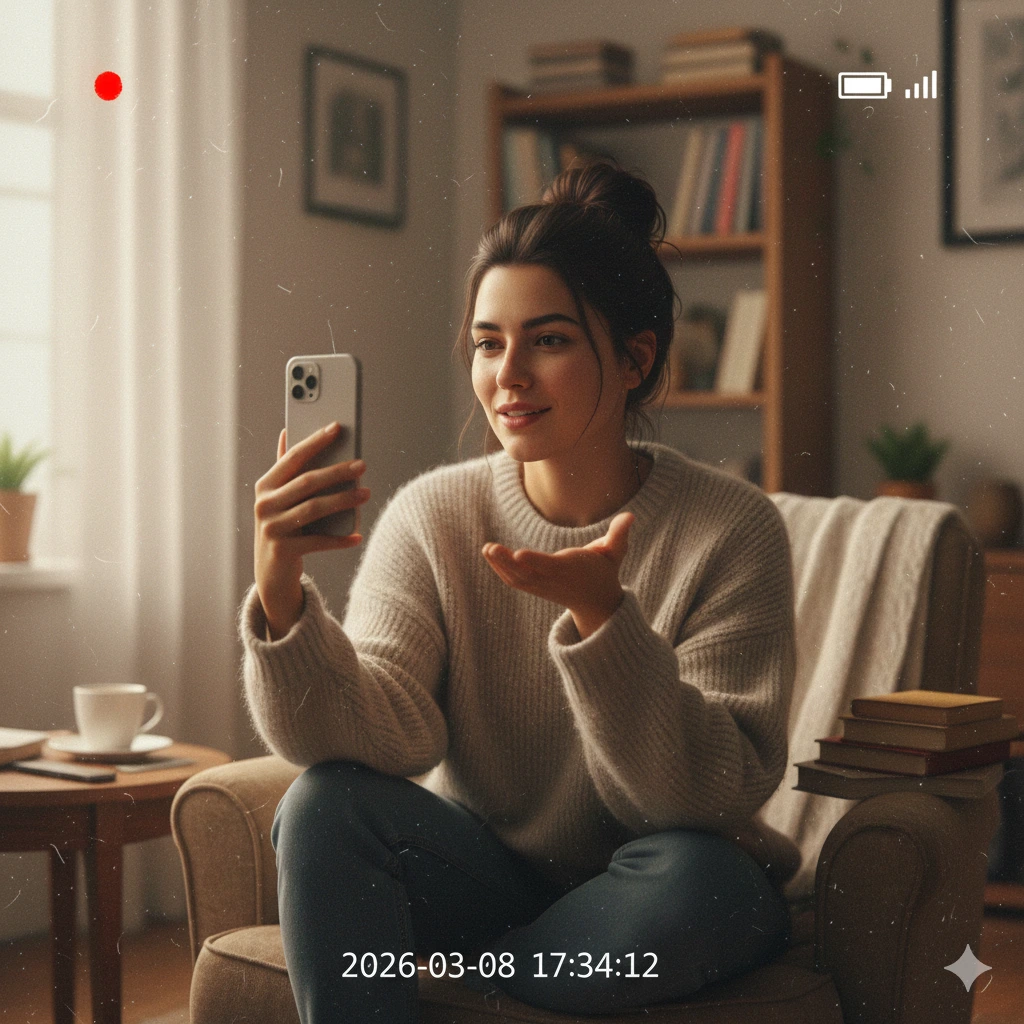
This is the undisputed king of high converting ad creatives right now, especially on platforms like Instagram Reels and TikTok.
But be careful—I’m not talking about the “polished influencer” UGC of 2023. You know the kind: a perfectly made-up influencer doing an obviously scripted unboxing in a flawless apartment. People see right through that now.
In 2026, “Lo-Fi” (Low Fidelity) is in.
What it looks like:
- Shot on a phone, often using the front-facing camera (selfie style).
- Bad lighting isn’t a dealbreaker; sometimes it helps add authenticity.
- The person looks like a real customer, not a model. They might stumble over their words slightly. It feels raw. This rawness is exactly what makes these high converting ad creatives so powerful.
- It focuses on a specific problem and solution, not just “this product is pretty.”
Why it works: It breaks down the trust barrier instantly. It feels like a FaceTime call from a friend recommending a product. Because it doesn’t look like an impressive ad, the viewer’s “sales defense” shields stay down for the first few crucial seconds.
How to steal it: Don’t hire an expensive agency. Get your actual customers (or even your team members) to record genuine reactions to your product. Give them bullet points, not a script. Let them be human.
Example 2: The “Text-Only” Static (The Shocking Comeback)
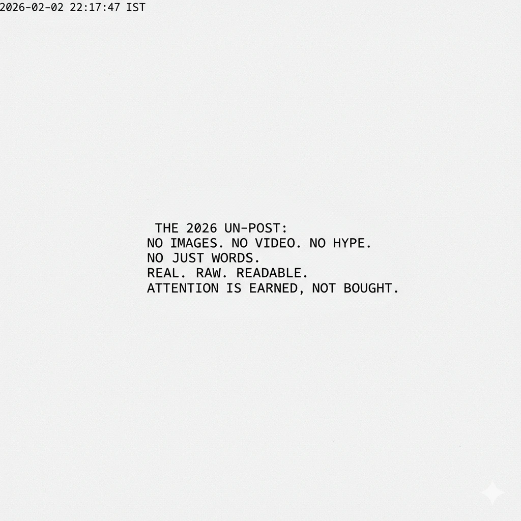
Wait, a static image? In 2026? Isn’t video everything? es, but some of the best high converting ad creatives right now are actually static
Here is the contrarian truth: Because everyone is shifting to video, the feeds are clogged with noisy, fast-paced Reels.
Suddenly, a simple, bold, static image acts as a “pattern interrupt.” It stops the eye because it’s quiet. This disruptive quality is a mark of high converting ad creatives.
But I’m not talking about a boring stock photo of people shaking hands. I’m talking about Text-Heavy Statics.
What it looks like:
- A solid background color (often bright or stark black/white).
- A very short, punchy headline that addresses a pain point or makes a bold claim.
- Sometimes it looks like a Twitter (X) post screenshot, or an iPhone Note, or just bold typography.
- No models, no lifestyle shots. Just the message.
Why it works: We live in an attention economy. A video asks for 30 seconds of my time. A text static can be consumed in 0.5 seconds.
If you have a strong hook—like “Stop spending ₹500 on coffee”—a static image delivers that message instantly. It respects the user’s time. These are currently seeing incredible Click-Through Rates (CTR) for B2B and service businesses.
How to steal it: Take your best sales headline. Put it on a colored background in a bold font. That’s it. Test it against your expensive video.. You might be shocked that simple text can be one of your most high converting ad creatives.
Example 3: The “Us vs. Them” Split Screen (Visual Proof)
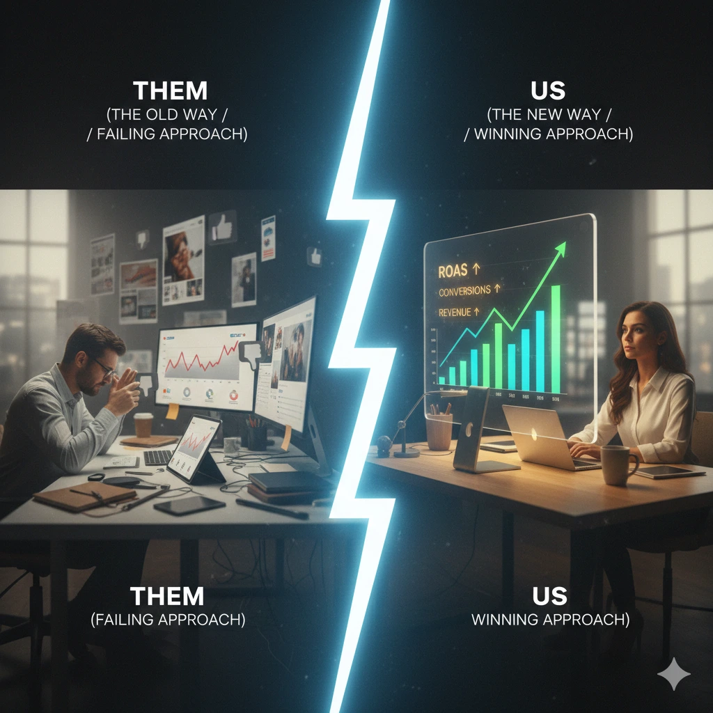
The human brain loves shortcuts. We hate having to read paragraphs of text to understand why your product is better than the competition. High converting ad creatives often do the thinking for the customer.
The “Us vs. Them” creative does the thinking for the customer. It is one of the most enduringly high converting ad creatives because it’s pure logic presented visually.
What it looks like:
- A split screen (usually vertical for mobile).
- One side is labeled “Others” or “Current Solution” (showing the painful, messy, or expensive way).
- The other side is labeled “Us” (showing the easy, clean, affordable way).
- Green checkmarks on your side; red X’s on their side.
Why it works: It’s undeniable visual proof. You aren’t just claiming you are faster; you are showing it side-by-side. It forces a comparison where you are the obvious winner. This clarity is essential for high converting ad creatives.
This works incredibly well for SaaS products, cleaning products, or anything that saves time.
How to steal it: Identify the biggest pain point of your competitor’s product. Visualize it on the left. Visualize your solution on the right. Keep the text minimal. Let the image do the work of high converting ad creatives.
Example 4: The “Platform Native” Ad (The Chameleon Effect)
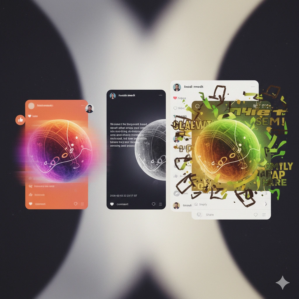
Remember the rule for 2026: The best ads don’t look like ads.
“Platform Native” creatives are designed to mimic the exact user interface (UI) of the platform they are running on. They mask themselves as organic content. This isolation makes them high converting ad creatives.
What it looks like:
- On Instagram/Facebook: An ad that looks like a screenshot of an iPhone “Notes” app, a Reminder notification, or a text message conversation.
- On Reddit/Twitter: An ad that looks exactly like a standard text post from a user.
- On TikTok: A video using the native text fonts and sounds that are currently trending on the platform.
Why it works: When we scroll, our brains are filtering out anything that looks “strange” to the platform. A glossy banner ad stands out like a sore thumb on Reddit. But a post that looks like a native Reddit thread gets read.
It tricks the brain just long enough to get the hook across. By the time they realize it’s an ad, they’ve already consumed the message. That’s the goal of all high converting ad creatives.
How to steal it: Study the platform you are advertising on. What does organic content look like there? Replicate that aesthetic perfectly. If you are running ads on Instagram Stories, don’t use a horizontal video; use a 9:16 vertical format that feels like a friend’s update to build high converting ad creatives.
Example 5: The “Direct Offer” Graphic (No Fluff)
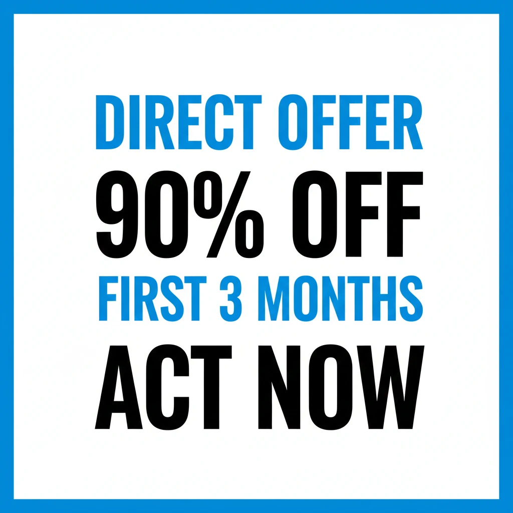
We’ve talked a lot about “un-marketing” and being subtle. But sometimes, to build high converting ad creatives, you just need to hammer the offer
This is especially true for the Bottom of Funnel (BOFU)—the people who already know you. (If you don’t know what BOFU means, check out our guide on: Meta Ads Funnels Explained).
When retargeting someone who abandoned their cart, don’t show them a Lo-Fi video introducing your brand. They know who you are. They want a reason to buy now. To turn these people into buyers, you need specific high converting ad creatives tailored for them.
What it looks like:
- The product is the hero shot.
- The text is huge and focuses solely on the deal: “50% OFF,” “LAST CHANCE,” or “FREE SHIPPING ENDS TODAY.”
- It creates clear urgency and scarcity.
Why it works: For a warm audience, clarity beats cleverness. These are high converting ad creatives because they remove friction. The user is thinking about buying; this ad gives them the final push.
How to steal it: Keep it simple. Product + Big Offer + Urgency. Do not clutter this with long paragraphs about your brand story if you want high converting ad creatives at this stage.
The Anatomy of a Winning Ad: How to Build Yours

Okay, you have the 5 examples. But how do you actually construct them?
Whether you are making a Lo-Fi video or a Text Static, almost all high converting ad creatives in 2026 follow a similar structure. You must nail these three elements to ensure you are building high converting ad creatives:
1. The Hook (The First 3 Seconds)
This is 80% of the battle. If you don’t stop the scroll in 3 seconds, you are dead.
- Bad Hook: Your logo slowly fading in. (Nobody cares).
- Good Hook: A surprising visual, a bold statement (“Stop doing this”), or immediate action.
- Tip: Check your video retention stats. If 90% of people drop off at the 2-second mark, your hook failed.
2. The Value (The Body)
Once you have their attention, you have to keep it. Deliver on the promise of the hook. Show the solution. Be concise. Don’t bore them.
3. The Call to Action (The CTA)
Do not assume they know what to do next. Tell them.
- “Shop the sale at the link below.”
- “Download the free checklist here.”
If you have these three elements, even an “ugly” ad can convert like crazy.
To find tools and learn about them read : Facebook ad creative analysis tool
Conclusion: Stop Overthinking, Start Testing
If you take one thing away from this post, let it be this: Perfection is paralyzing your profits.
In 2026, the brands that win aren’t the ones with the biggest studios; they are the ones that test the fastest to find their high converting ad creatives.
The beauty of these “Lo-Fi” and “Text-Only” creatives is that they are cheap and fast to produce. You don’t need weeks of time to generate high converting ad creatives. You can shoot a Lo-Fi video this morning, put some text over it this afternoon, and have it live by this evening.
So, stop obsessing over the lighting. Stop trying to make it look like a TV commercial. Grab your phone, find a quiet corner, and just start talking to your customer about how you can solve their problem.
It’s time to launch.
Before you do, make sure your account is actually ready to handle the traffic. Don’t waste budget on a broken setup. Run through our essential: Meta Ads Checklist first to ensure you are ready for liftoff.